
Raid Energy Tea
CLIENT
Raid (fictional)
YEAR
2024
DELIVREBLES
Brand strategy
Brand identity
Packaging
Naming
MY ROLE
Lead designer
Raid Energy Tea is a new company introducing a fresh concept: energy tea. With energy drinks becoming increasingly popular, Raid is ready to challenge the market with a healthier, tea-based alternative aimed at active, health-conscious consumers, especially gamers.

The challenge was to create a visual identity engaging enough to make gamers want to swap their go-to energy drink for energy tea.
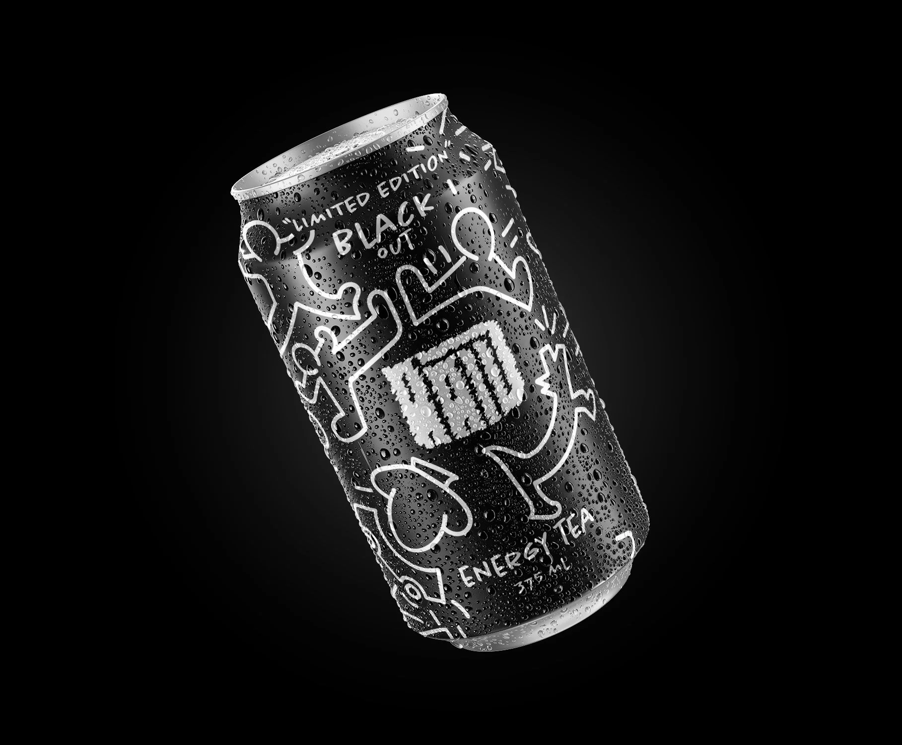
I designed the logo and the can. The logo is built around a scribble effect that matches the illustrations, which draw on the style of graffiti artist Keith Haring. He was not a reference from the start. I began by experimenting with scribbles and sketches, and the Haring influence emerged as the drawings developed. The characters carry a lot of movement and energy, which mirrors the idea of an energy tea, and the style gave the brand a hip look that could help win over new customers.


Rather than traditional tea packaging, Raid is sold in a can, which feels familiar to energy drink consumers. By placing the product in the same aisles where gamers already shop, it meets them where they are. The playful, hand-drawn illustrations and bold, vibrant colours create the visual impact needed to encourage the switch.